In an instant, someone can determine if they’re attracted to your brand and if they want to be your customer. And what this often comes down to is – your design. Design often determines the first notion of your brand rather than the words you say. The same goes for the quiz design!
If you’ve already decided to create a quiz but have been stuck with where to go with the design, you aren’t alone. In this post, we have covered the quiz format, tips on quiz design, and how you can create your own quiz.
No matter what purpose you are using a quiz for, your quiz design will help you create a memorable experience for everyone who lands on your quiz. So, let’s look into the article
- Quiz Design Format – Basic Structure
- Best Tips on Quiz Design – Choose a visual theme for your quiz
- Using color theory to influence your quiz design
- Include an eye-catching cover image
- Select the right typeface and font pairings
- Question and answer images
- How to Create an Online Quiz in Google Forms?
Key Takeaways
- Quiz Design has a basic structure that every quiz maker follows or it is created keeping in mind the basic structure. Quiz format consists of 4 portions – title, description, contact page/section (it is an optional part that if you want to add you can or not), and quiz questionnaire.
- To create quiz questionnaire there are few tips to follow like, sequence of questions to be proper, keep questions simple & minimal, and have consistency with answer options.
- There are few tips on quiz design, to design a quiz – choose visual theme for your quiz, include eye-catching cover image, select right font style, and even use colour theory to influence your quiz design.
- Google Forms is one of the best online quiz maker and free too. It is very easy and simple to create quiz in google forms.
Quiz Design Format – Basic Structure
Now let us talk about the basic quiz design structure. To create any quiz, two things are crucial, first is the quiz questionnaire that makes the basis of any quiz. Second is the quiz design and overall style. However, these are not the only things that are required while creating a quiz.
A quiz format consists of 4 portions that describe the overall structure. Though depending upon the quiz maker online quiz format style might change and depends upon the individual to individual. But, some of these portions/sections are constant in every quiz design. Let’s go through each one of them.

1. Title
The quiz title is the clickbait part of your overall quiz design. It basically decides your webpage fate. Apparently, this is the first thing people see on the search and decides whether to click on the quiz and explore more or not.
For example – Title 1: Trivia – ‘Game of Thrones’ Quiz
Title 2: Can you pass the ultimate ‘Game of Thrones’ Trivia Quiz?
Which one are you likely going to click? For us, it is going to be the second title and if you are likely going to click on it then you know what you have to do in order to design a quiz that attracts an audience by just looking at the title.
It is necessary to understand that title of any quiz must be self-explanatory. Sometimes, while choosing an attractive, catchy title we might forget to make it clear as well. If the title confuses the users there is a high chance that the audience will skip your quizzes. So, if you can’t create catchy yet clear titles, stick to simple yet SEO-friendly titles.
2. Description
The next step that anyone creating a multiple choice quiz should do is to provide the quiz-takers with a clear-cut idea of what the quiz is going to be about. If you are using Google Forms then under the title you get the description area to be filled.
This optimization is necessary to attract audiences and not confuse them, a title can just provide a brief idea of the quiz. However, what you are expecting from your audiences can only be described in a little detail as description.
There are various quiz makers online that are more advanced to let you create a great description section.
3. Contact Section/Page (Optional)
If you are taking up a quiz online you’ll find many it might ask you for contact details mostly like email-id and your name. This is because quizzes are a great way to maximize leads and conversion on your website. It is a great way for digital marketing, you can email them newsletters, offers, product launches, and new blogs.
Besides, it can be also a great way for market research, you might want to add a contact form. It is not a mandatory section to add to your quiz if you don’t want to invade quiz-takers personal contact details.
In Google Forms, you can create a contact questionnaire section with name, email-id, etc. And keep it required or unrequired based on your preferences.
4. Quiz Questionnaire
Last but not least, this is the body of the quiz. For this specific reason, whenever designing a quiz, your research and brainstorming are to be taken into consideration. If you incorporate your vision with the right audience you would be able to create effective sets of questions.
There are a few tips for making the best quiz questionnaire –
- The sequence of your questions to be proper – Start your quiz with warm-up questions leading towards exciting material. So that individuals are committed till the end or till they reach the most challenging questions.
- Keep your question type simple and minimal – Questions should be only one basic sentence and not too much of words and meaning should be added to it.
- Have a consistent number of answers – each question should have the same number of answers unless you have a specific reason for changing the answers like [yes or no].
- Don’t make your questions too obvious – To make the quiz interesting, you should make sure questions and answers are obviously pointing towards a particular outcome.
Best Tips on Quiz Design
How a quiz look is just as important as how it functions, but creating a visually stunning quiz doesn’t happen by chance. It’s created with a purpose for a purpose.
As we have already discussed halfway through the quiz design process with the basic structure of the quiz design. Let’s now go through the design aspects – a few best tips to create visually authentic and true to your brand quiz design.
1. Choose a visual theme for your quiz
Visuals matter not only are they aesthetically pleasing but they’re also the most effective mode of communication. But first thing first – the visual theme for your quiz must resonate with your target audience. The quiz design should be created to attract them not yourself.
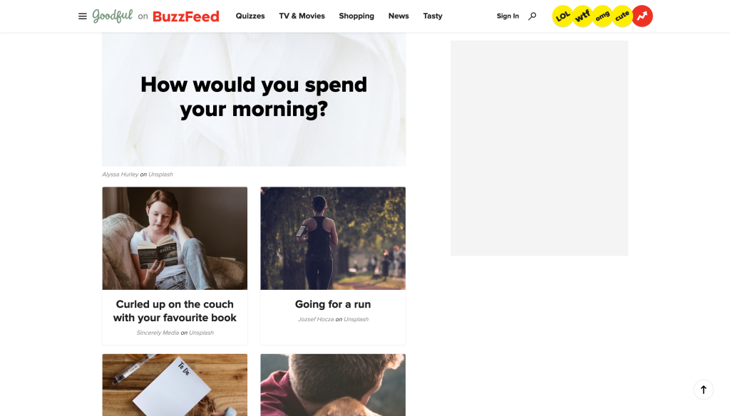
For example, BuzzFeed uses interesting and attractive cover images with their titles to attract audiences to take the quiz.
2. Using color theory to influence your quiz design
Have you ever noticed how various colors evoke various emotions? For instance, when we see cool colors like blue and green it evokes a sense of calmness or peace in people’s minds.
Marketers use this technique of color theory to influence the way you view the brand, whether we realize it or not. The same principle can be applied to quiz design, select a color palette that starts with a single color and choose different shades or tones of that color.
In google forms, you get the option to customize the background and theme color.
3. Include an eye-catching cover image

In addition to the title of the quiz, people will also see the cover image right away. Needless to say, it has to make a great first impression. Cover images are meant to catch your audience’s attention while illustrating what your quiz is about.
Choosing the right cover image is indeed important, a right cover image consists of high resolution, attracts the audience, and loudly shows what your quiz is intended.
If you are using Google Forms then you must know that though google forms don’t have the feature that allows you to add a cover image, however, it does let you add a header image for a more customized design.
4. Select the right typeface and font pairings
When it comes to quiz design paying attention to the fonts you use plays a part. It’s best to use a consistent font for your entire brand so you continue to offer a well-sought-after cohesive look.
There are hundreds of fonts to choose from however you’ll need to first understand the kind of fonts that the audience will love and understand. Google Forms has a fonts feature as well that allows you to change the font style of questions and answers [though it doesn’t have a variety of fonts style].
5. Question and answer images

Another way to design a quiz is to include question images or answer image options to the quiz. As it is, visuals keep the audience engaged all the way through your quiz, making it feel more fun.
The more you use imagery, the more you’re likely to hold your audience’s attention. This also means you are likely to make more sales from your quiz, and more email subscribers.
Google Forms allows you to add images to questions and answers. Besides, it lets you add an image or video as a question.
These were a few tips for quiz design that can make your quiz more attractive for your audience and ultimately increase your brand awareness and even sales.
How to Create an Online Quiz in Google Forms?
Now that you know how to design a quiz, let’s see how you can create an online quiz. Undoubtedly, there are various quiz makers online available, however, Google Forms is one of the free and great quiz maker online. Anyone from beginner to professional level people can use Google Forms and create a quiz, or for any use cases.
To create a quiz in Google Forms is quite an effortless process to go through. I have discussed the process of quiz design in google forms extensively in my previous article. Check out this article to see how to create a google forms quiz – How to make a Google Forms Quiz?
Wrap-Up
Now you have everything you need to know to make a statement with a quiz design. In this article we covered how to design a quiz with a basic quiz format, further we discussed a few steps on how you can visually design your quiz.
You can use Google Forms to create your quiz as it has many features (mentioned above in a few tips). Besides, you can install various add-ons to make your quiz more beneficial. For instance, ExtendedForms is a great timer and proctor add-on for google forms. If you want to add a timer to your quiz, you can install this add-on.
Apart from that, it has features like ‘brand customization’ that can help you with quiz design purposes. Moreover, you can include a ‘welcome message’ as the add-on has the feature, in-fact you can add [copy-paste] messages into different languages and show the same message in different languages to an audience.
There are many other features to check out of ExtendedForms!


