
Looking for an easy way to turn survey results into presentations?
You’ve done all the creating, designing, and distributing of your survey work. And now the results are rolling in. What to do? Show off your survey results in a presentation. in a fantastic way of course! We got that here in this article. Here are some tips to help you turn survey results into a great presentation.
While the downloadable or emailed survey report is the more traditional way of presenting survey results, there are better and more engaging ways today. One of these is through a live, visual presentation.
Whomsoever you’re presenting survey results, visual live presentations help drive greater engagement and collaboration. Subsequently, brings about better decision-making and actions. So, let’s first look into ways to present survey results.
Table of Contents
Key Takeaways
- There are different ways to effectively present survey results through charts and graphs, infographics, video infographics, and live-presentations
- There are best practices or tips to use or follow to turn survey results into great presentations. Firstly, it is necessary to choose the data that has to be presented, not everything can be added to the presentation.
- Furthermore, providing a presentation structure is better, like presenting data in a story format. Apart from that, visualize the survey results, adhere to basic design rules, show open-ended questions in style, and use the right presentation tool.
- Google Forms displays survey results to make the presentation process easier and quicker. It shows results in summary in charts and graphs format that can be copied and pasted to their presentation.
- Besides, you can also connect forms to sheets to have data in sheets where you can also create charts for the data.
Ways to Effectively Present Survey Results
A survey is a useful way to collect data from the market, know the latest trends in the market, and about consumer preferences, etc. The best technique for understanding a survey is to visualize it, as otherwise, it will be difficult to interpret the data.
You can display survey results in different ways from simple charts to presentations and more. Here we will look into a few ways to effectively present survey results analysis.
1. Charts
A chart [like a pie chart] or a graph is the most common and popular visual representation of survey data. The major objective of using charts or graphs is to display survey results report in a meaningful manner.
There are several types of charts that can be used to display survey results. However, it is important to use the correct chart at the right time basically they can be said as Good charts. They convey information easily to the audience, whereas bad charts leave you confused.
2. Infographics
Infographics are another great way to share information with your audience. Survey results are easily interpreted into graphs and charts, making survey results & infographics a perfect combo.
Infographics a modern survey reports that are not only eye-catching but also make data look pleasing and impactful.
3. Video Infographics
Video infographics are another type of infographic to represent data animatedly. Such types of survey results reports are created by combining different animations in one video. Besides, it helps to explain survey data engagingly.
4. Presentations [Real-time Visuals]
Last but not least is Presentations. Creating survey results into live presentations can help data to be more understandable to your audience, especially in the corporate world. The best of present survey results in a report is by turning every data, and statistic into a visual presentation.
Creating a visual presentation is an art. You must take a lot into account like the type of data you would like to share, the medium for your data, and apart from the design and quality of your presentation.
From Powerpoint and Google Presentation to Prezi, there is a whole host of presentation tools available with features including animated gifs, and transitions that bring your presentation to life.
Tips to Turn Survey Results Into Presentation
As discussed in the above section, there are different approaches to presenting survey results analysis. To turn survey results into presentations is a great way, widely used in the corporate world to present statistics and overall data of surveys of the market.
With the help of graphs and charts, one can create a visual presentation that makes your data look fun and interesting instead of boring and dragging. To turn survey results into presentations there are a few tips and ways that you can and must follow to be presenting survey results in a great way.

Choose the data
You may have tons of insights from the survey results or survey results to deal with. All of them may contain a wealth of useful information, however, not every insight might benefit your audience.
Therefore, be selective with the data you want to present and your presentation needs to be clear and concise. Think about what you want your audience to take away from your presentation and then choose your data accordingly.
Tell a Story [Presentation Structure]
When it comes to turning survey results into presentations, some of the best results are possible when they are presented like a story. To present it in an effective story way you must follow the presentation structure, and you’ll be able to communicate the key findings to your audience.
- What’s the most crucial issue? – Whatever your burning question is that you’re trying to find answers to through a survey, make it your key theme. Engage your audience with its outcome.
- Focus on what data means to your audience – present survey results that might impact your audience’s lives or their work. While they’ll be keen to hear about your survey’s findings, they’ll be more interested to know how this might impact them.
- Communicate actions you need your audience to take – Whatever you’re presenting they are likely to take action. So, whatever the actions, it needs to be communicated clearly.
Visualize the Survey Results
Besides the presentation structure, you also need to be thinking about what visuals will bring your data and story to life. As indicated in the previous section we discussed various ways to present survey results. You can present data with graphs and charts, infographics, or focus on numbers because influential statistics are key to resonating with your audience.
Adhere to Design Rules
There are several design best practices that you should follow to present survey results into presentations in a beautiful way, like using a minimalistic background, placing only major points on the slides, and avoiding block copy. Furthermore, you can customize the color, like changing each bar based on your preferences.
Display Open-Ended Questions in the Style
You can add open-ended questions though they cannot be included in the graphs and charts. But they do make a good contributor, besides you can ignore results from open-ended questions while making a presentation.

Showing what your audiences have to say about your product or feedback, or anything can drive your point home. To present it in a visually attractive manner you can use it in a ‘word cloud’ style. It can help break down your respondents’ most commonly used words/phrases in a way that’s visually intuitive.
The Right Presentation Tool Can Make a Difference
There are several presentation tools available, each with its own unique benefits. Your work is to choose the tool that can help you showcase your data just how you want them to. Besides, that has a feature set that allows you to visually present the date you want to show.
Following are the few presentation tools that are widely used and come in handy for your presentations.
- Powerpoint
- Prezi
- Google Slides
- Empressor
All of these tools are very popular and many of them allow you to use animated gifs, which can make presentation display more appealing.
How to Present Survey Results with Google Forms?
There are various tools to create surveys and one of them is none other than Google Forms. Google Forms is a free survey tool that allows you to create surveys for any purpose. Here, we are going to through steps to discuss how Google Forms help you in survey results reports and how you can present survey results in presentations.
If you want to know how to create a survey in Google Forms in detail, then you may want to first check this article – How to Create a Survey in Google Forms? [Beginner’s Guide]
Step 1 – Let’s just imagine that in this first step, we have set the Google Forms, selected a blank form or a template created the survey with a questionnaire, and configured all the necessary settings.
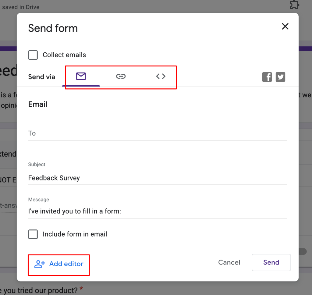
Step 2 – Once all the creation part is completed it’s time to send forms to your target audience. So, to do so click on the Send option, you can add collaborators (add editors option) from there and then to send there are three options available.
Copy the link if you want to send it to a large mass or embed HTML to your webpage. Otherwise, you can also send email invites to your audience.
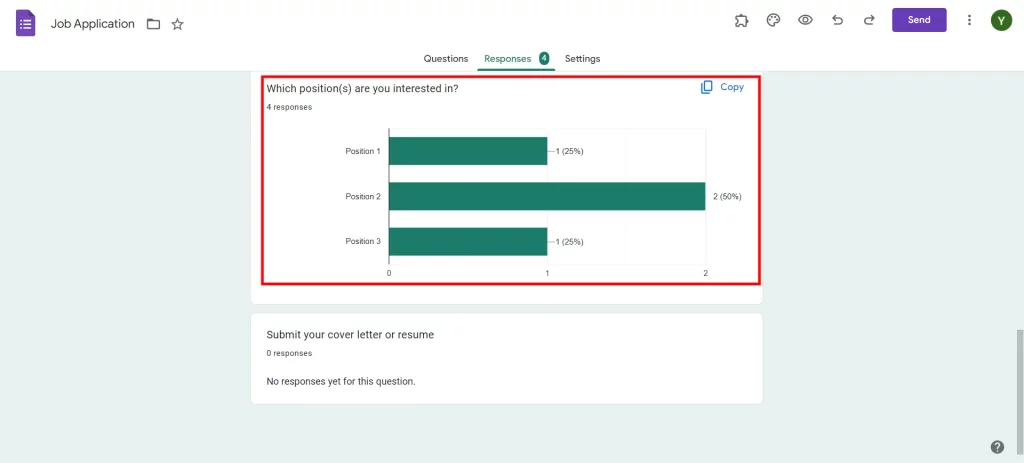
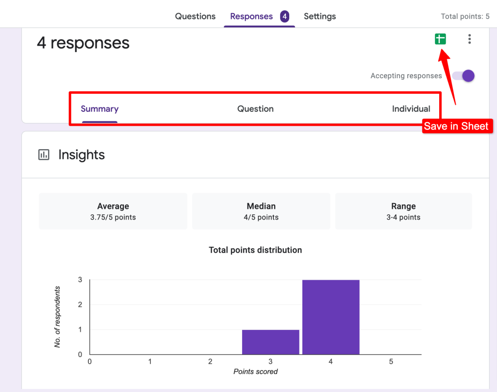
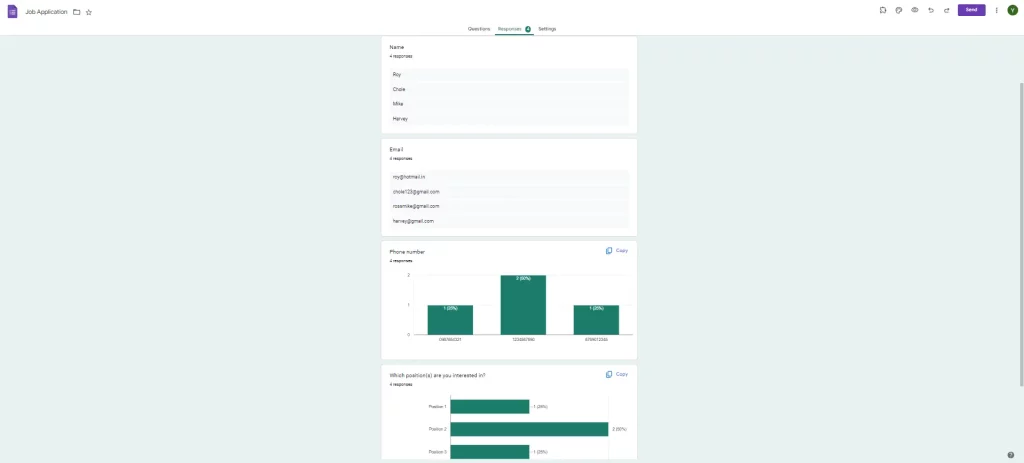
Step 3 – Once you’ve sent the survey to your audience and started receiving responses, you can view the result data under the Responses tab in three different ways.
- In summary, you will find responses to each question in charts and graphs format. You can also see insights of the results.
- In the Question option, you can find each question’s response result.
- Under the Individual option, you can see each respondent’s results.
Step 4 – If you want to turn survey results into a presentation, you just have to copy the summary of each question result under the Summary option. Then you can paste it into your presentation.
However if you want more customization for your charts and graphs that Google Forms summary doesn’t allow, we have another option with the help of Google Forms that you can follow.
It is to connect Google Forms with Sheets and you’ll receive all the data there that you can then analyze and make into charts and graphs.
Step 5 – In Google Forms, go to the ‘Responses’ tab, click on the ‘Create Spreadsheet’ icon, and your Google sheet will be ready with all the questions and responses. It will open up to your Google Sheet with all the form data inside it.
[Note* You could also create a spreadsheet while creating the Google Forms, just click on the sheet icon and you’ll have a sheet for that form. Afterward, all the responses you will get also be updated in Google Sheets.
You can also download responses in as .csv format if you want to open it in an Excel sheet instead of a Google spreadsheet.]
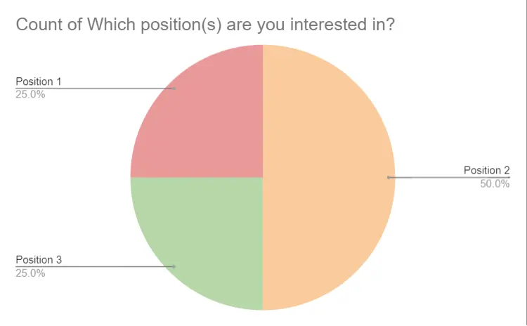
Step 6 – Once in the Google Sheet, select all the data in rows and columns. To select a column, click on the top cell that contains the question and scroll it till the end of the responses.
Step 7 – Now, click on the ‘Insert’ from the toolbar at the top. From ‘Insert’ select ‘Chart’ to generate a chart. In the ‘Chart Editor’ dialogue box on the right side, under Setup select chart type, add a label to your chart (which should be the question), etc.
Step 8 – Click on the ‘Customise’ tab in the ‘Chart Type’ and customize the chart or graph according to your liking.
Step 9 – You can copy the charts and graphs to any of your presentations.
There is another way that is a bit more extensive however it not only lets you download responses in a .csv file but it has other features that you can make use of. Another way is ExtendedForms for Google Forms, it is a timer and proctor add-on that shows you the summary of the responses, along with the responses of each respondent, and is also able to download CSV files.
- To start with, install the ExtendedForms app, once installed you’ll see a puzzle-shaped icon on the top bar. (If you don’t see one, refresh the page) Click on it > ExtendedForms > Configure.
- The settings dialogue box will appear, and you will see all the basic settings configurations (like share, timer) to configure.
- Go to the main settings page of ExtendedForms or dashboard, and click on the ‘Responses’ option in the settings box in Google Forms.
- It will take you to that Forms page of ExtendedForms. Click on this ‘፧’ icon and then ‘Export CSV.’
- The Excel sheet will be downloaded to your device using that particular form.
- You can either open it in your Excel sheet or you can also open it in your Google sheet.
This is how anyone using Google Forms can see the results and turn them into a good presentation with visuals.
Wrapping Up
You’re nearing the end – your charts look great and you’ve picked out some great quotes to highlight your main points. Now it’s time to share your hard work and survey results analysis.
This was our guide to how one can turn survey results into presentations. We have provided you with tips on how it can make your work easier if you use Google Forms. Besides, it has ExtendedForms add-on power to advance your survey you can also download a .csv file to analyze the data in an Excel sheet.
Furthermore, the add-on allows you to set deadlines and auto-submit surveys when the timer ends. You’ll not only get a countdown timer for your form, but you will also receive summary analytics in the form of a bar graph on the ExtendedForms dashboard. Try out the add-on, but first, check out its website and blogs to learn more.
If you like reading this, also consider reading our detailed guide on Creating Business Forms Using Google Forms (7 Simple Steps) and How to Add a Hyperlink to Google Forms. (7 Simple Steps).