
Get ready to uncover the secrets of creating a pie chart in Google Forms. In this engaging blog, we’ll guide you through the straightforward process of crafting a pie chart effortlessly within Google Forms—yes, it’s entirely possible!
Once you’ve collected data with Google Forms, the next step is analysis. Pie charts are a fantastic way to visualize your data effectively. Although Google Forms provides built-in response summaries with charts, creating a more refined pie chart requires leveraging Google Sheets. Let’s dive in and explore how to do it!
Table of Contents
What Is a Pie Chart?
According to the Internet, pie charts (or circle charts) are circular statistical graphic representations of data. It is divided into slices (like a piece of pie) to illustrate numerical proportions. In a pie chart, each section or arc length of each slice is proportional to the quantity it represents (whole pie).

Simply put, the ‘pie’ represents 100% of the whole, while the slices represent a portion of the whole. The pie chart represents the information we seek in a structured manner to ease decision-making.
They are useful when you need to show the breakdown of a whole into different categories. Besides, it is used in classrooms, for business conferences, & everywhere. It’s used for in-depth analysis, and for that reason, we will see how to create a pie chart in Google Forms.
Can You Use Google Forms to Create a Pie Chart?
Google Forms has been for so long providing users with the possibility of creating questionnaires and conducting online surveys, polls, and quizzes. Besides, the forms permit respondents to freely submit their responses and can be used to conduct small-scale to large-scale surveys.
Although, Google Forms has a feature of an in-built summary that shows responses incomprehensible graphs and charts, still lags behind in terms of customization. To make a pie chart (or customizable charts) with Google Forms data, you can make use of Google Sheets.
Integrated with Google Forms, Google Sheets can be used as a Google pie chart maker, it can natively export the forms data and use it to create all kinds of graphs and charts.
How To Create Google Forms Pie Charts?
If you want to create a pie chart in Google Forms, you’ll need to depend on Sheets to extract the data from Forms and use it to compile the pie chart. Following are the steps to guide you on how to create a Google Forms pie chart.
Step 1 – Link the Responses with Sheets
- Open Google Forms to create a survey or quiz for which you want to make a pie chart.
- Once you are done creating and customizing your forms, send it to your audience.
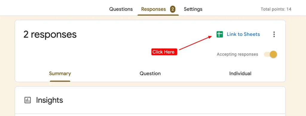
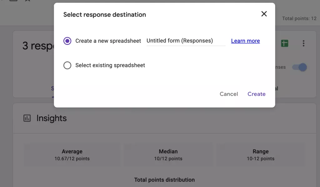
- After you’ve received all the responses from your certain respondents. Then, in Google Forms, go to the ‘Responses’ tab, click on the ‘Create Spreadsheet’ icon, and your Google sheet will be ready with all the questions and responses. It will open up to your Google Sheets with all the form data inside it.
Note: You could also create a spreadsheet while creating the Google Forms, just click on the sheet icon and you’ll have a sheet for that form. Afterward, all the responses you will get also be updated in Google Sheets.
Step 2 – Create a Pie Chart in Google Sheets
- Once in the Google Sheets, select all the data in rows and columns. To select a column, click on the top cell that contains the question and scroll it till the end of the responses, or select an empty column and scroll upwards till you reach the cell of a query.
- Now, click on the ‘Insert’ from the toolbar at the top. From ‘Insert’ select ‘Chart’ to generate a chart. [Sometimes you’ll not get the default pie chart diagram, so don’t worry about it you can pick your own charts.]
- In the ‘Chart Editor’ dialogue box on the right side, click on the drop-down menu of ‘Chart Type’ and select a pie chart from the ‘pie’ section.
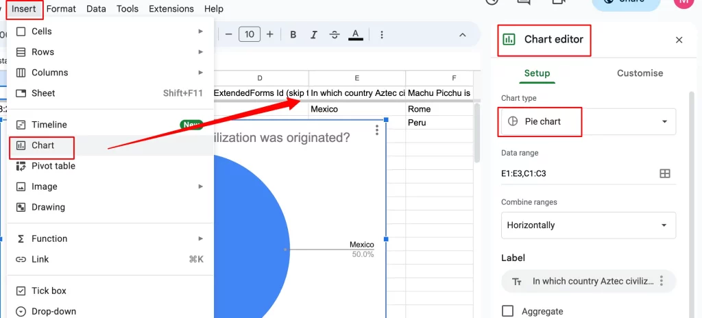
You can select from any of the given three pies. In the ‘Setup’ section you can change the format of your pie chart. Everything will probably be in the generated pie chart but, if you think something is missing or want to change it around you can do it from here.
Ready to go one step ahead with your timers in Google Forms? Read ExtendedForms Unveils: Customized Timer Themes.
Step 3 – Customize Your Pie Chart
- Click on the ‘Customise’ tab in the ‘Chart Type’ and customize the pie chart according to your liking. You get the following options to customize
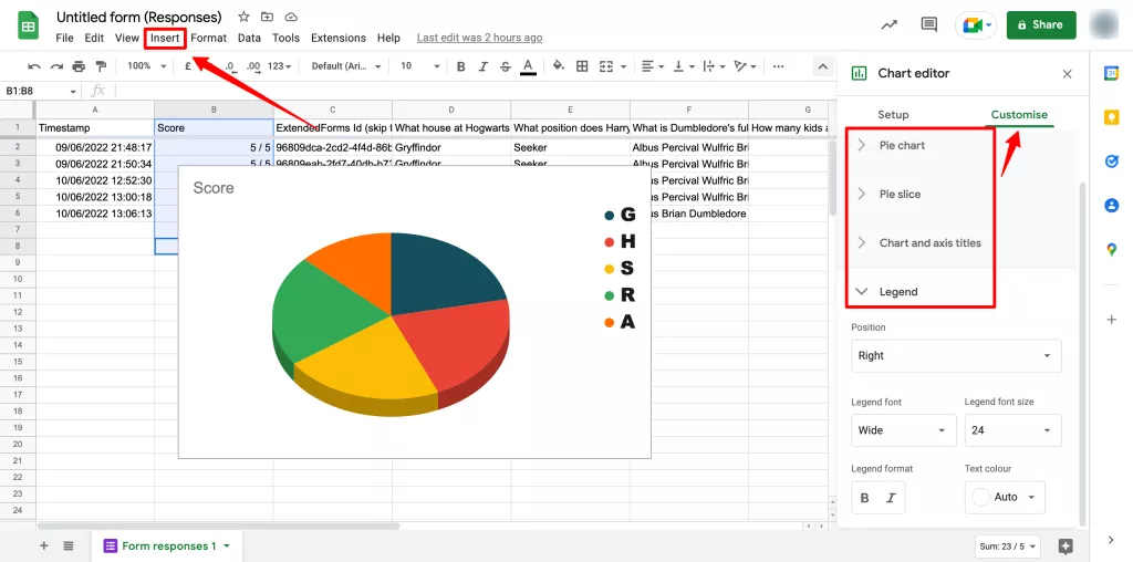
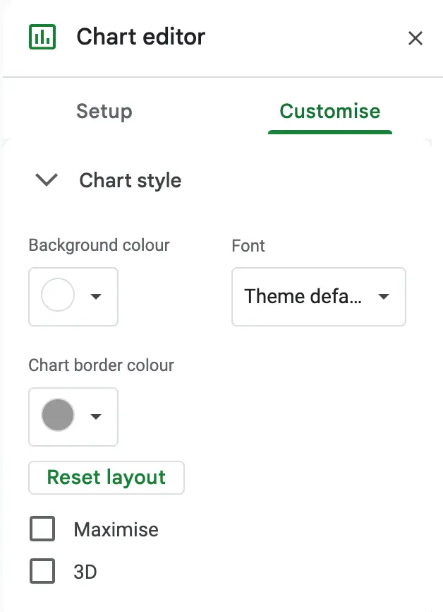
- Chart Style: It lets you customize the look of the overall chart like background color, font, and border color. There are two checkboxes too, the first is ‘Maximize’ which will make your pie chart look bigger. And the other one is ‘3D’ which converts the pie chart into a pop-out effect.
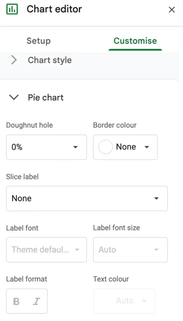
- Pie Chart: In this section, you can customize how the pie looks. Instances, doughnut hole (it is the hole in the middle of the pie), border color (which you won’t be able to customize in a 3D pie chart), slice label (i.e, each section of the pie), and label font, size, etc.
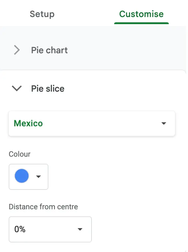
- Pie Slice: It specifically targets each pie on the chart. It includes slice titles (you have to select any of the slices and then customize two options given), the color of the slice, and the distance of the slices from the center.
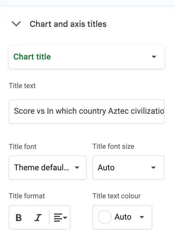
- Chart & Axis Titles: This section focuses on the chart & axis titles to be customized. You can change the title of the overall chart or change the label of each axis. It has options – chart title/chart subtitle (you can select any one of them at a time to customize), title text, font, font size, and so on.
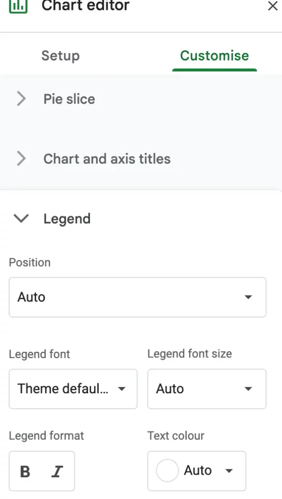
- Legend: It basically focuses on the label part of the pie that indicates portions of the pie. It customizes the look of the titles which indicates the sections of the pie. You can customize the position, font, font size, and text color.
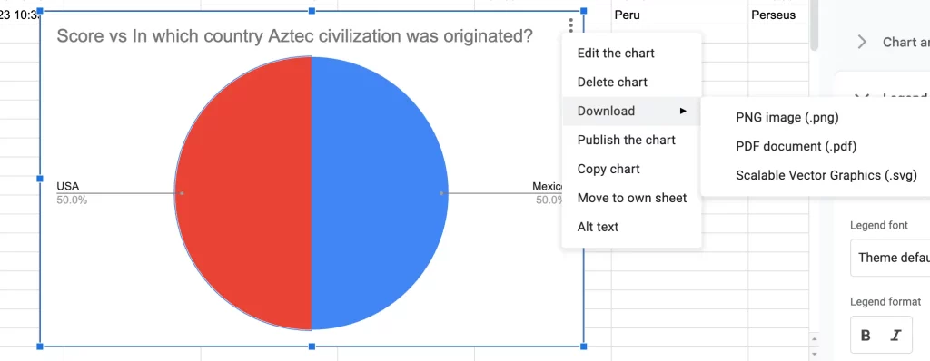
Step 4 – Download Your Pie Chart
- When you’re happy with how your pie chart turns out to be, you can download the pie chart to add to a presentation or a document. Click on the three dots in the pie-chart image at the top-right corner. Select download and choose the file format to download in.
Want to create a voting poll? Read How To Create A Voting Poll In Google Forms? (7 Simple Steps)
And that’s it! These are the steps of the process to create and download a pie chart in Google Forms.
Create Forms and Get Analysis With Extendedforms
Do you want to get the analytics of your responses (in graph format, you don’t have to do anything) but along with that the advantage of a countdown timer & proctor?
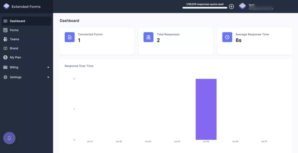
ExtendedForms is a timer and proctor add-on for Google Forms, you can integrate it with a 1-click countdown timer and easily include automated proctoring as well. Further, you can also track the responses to forms along with submission time in the app’s dashboard.
The app has other features like – brand customization, auto score import, teams feature (add unlimited users on Google domain, add team manager role), and classroom integration, to advance your Google Forms. To add a timer and track the responses following are a few steps:
- Install the add-on by navigating to ‘Add-ons’ through this ‘፧’ icon,
- Go to ExtendedForms and install the app
- You’ll then see a puzzle shape icon in Google Forms’ top bar [If you can’t see it, then refresh the page once].
- Click on it – ExtendedForms > Configure > then a settings box will appear on the right side
- [If you get the warning, then just click on ‘Fix Settings’ and it will be done]
- Set the time limit, share the form, restrict attempts, and hit the ‘Save’ button
- Now, to track the responses, click on the ‘Responses’ option in the settings box
- It will take you to that ‘connected form’ in the ‘Forms’ section of ExtendedForms main settings
- There you can see all the ‘responses’ and ‘pending invitations’, each respondent’s responses, etc
- To see the graph of the responses (it shows responses over time), go to the ‘Dashboard’ and you’ll see the summary of responses
FAQs
How do I make a pie chart in Google Forms?
Turn your Google Forms data into a pie chart by linking the form with sheets. It may not be possible directly to make a pie chart in Google Forms, but when you link the Form with Google Sheets, all data gets saved there and you can create the pie chart from sheets. Go to Insert > Chart and choose Pie Chart type.
Can you put a chart in Google Forms?
Google Forms has its own analytics section by default that provides the summary of the data users receive. You can get the summary in charts and graphs which can be copy-paste to another document.
How do I copy and paste a pie chart from Google Forms?
In Google Forms under the ‘Responses’ tab, you’ll find the Summary section along with ‘Question’ and ‘Individual,’ all the response data in charts and graphs will be present there. To copy-paste a pie chart in Google Forms, click on the ‘copy’ beside each chart and paste it anywhere.
From Google Sheets, you can download the pie chart, click on the three dots in the pie chart image go to download, and select the file format in which you want the chart to be downloaded.
How do I make a pie chart in Google Forms on my iPhone?
To create a pie chart in Google Forms on iPhone, first, you’ve to install the Google Sheets app and open the spreadsheet that is connected with Google Forms, select the cells you want to include in a chart, tap Insert > Chart, and tap Type to choose the chart type option.
To Sum Up
To summarize, creating a pie chart in Google Forms directly isn’t possible. However, you can transform its data into a pie chart by integrating it with Google Sheets. Regarding the accuracy of Google Forms charts for making reports, it largely depends on asking the right questions to obtain the desired answers.
Google Forms utilizes the reliable Google Analytics framework, ensuring data accuracy, and when combined with Google Sheets, you can generate professional graphs and charts. Additionally, if using Google Forms then we recommend you need a timer for quizzes or tests in Google Forms.
The ExtendedForms add-on is a great option. It not only provides a countdown timer but also offers summary analytics in the form of a bar graph on the ExtendedForms dashboard.
If you like reading this blog, also read our detailed guide on Best Google Forms Test Maker: ExtendedForms and How to Make Google Forms Accessible. [In 4 Steps].